Mobile Websites and Responsive Website Design
Mobile Website Design
These days, more of your customers are browsing on mobile devices. This presents challenges to conventional methods of website development because a standard website that is designed for a desktop screen will simply scale to fit on smaller screens. A small-scale version of your website makes it an awkward experience for the user to zoom and flick their way around your content.
There are multiple methods to display your website in an optimised way on mobiles. One of them is to create a separate 'mobile' website. This can mean maintaining two sets of content, and a separate URL for your mobile website.
While it is something that we build for customers when appropriate, we do not see this as an ideal option for most cases. The method that we recommend and integrate for mobile website design is Responsive Website Design.
Responsive Website Design
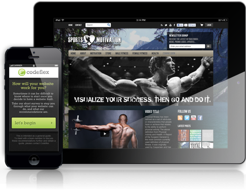
Display your website across all devices
We can build your website to be responsive, which means the design and content will transform and rearrange to fit the screen size for optimal viewing (rather than zooming out to fit a small screen).
A responsive website design means that all of your visitors are viewing the same URLs which is better for SEO and your website analytics.
Get in touch
Talk to us about how we can help you with your project requirements and bring your ideas to life.
Contact Julie or Natasha for an obligation free meeting or quote.
0408 536 379 (Natasha)
Send an enquiry